Marco Polo Motorsports
Brand Identity | Apparel
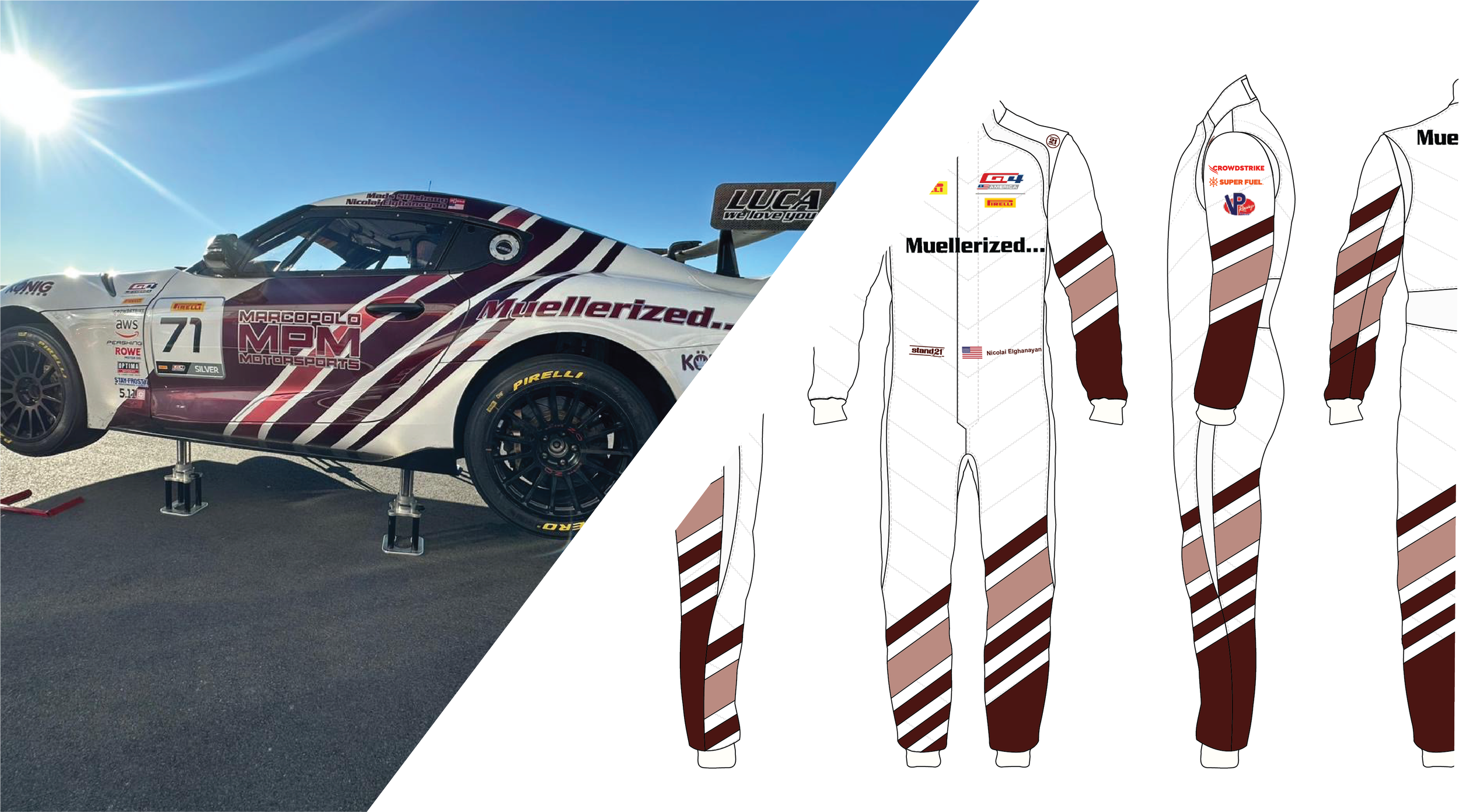
Momentum Intensity Progression
Marco Polo Motorsports was looking for a redesign of their crew uniforms and shirt merchandise with more personality and brand recognition. They wanted to keep a similar style as Supra race car but embrace a new visual presence at the track.
Time for a pit stop
Marco Polo Motorsports is a GT4 racing team that has been around for many years. While they have their own branding visible on their team logo and their car decals, they wanted something new. The problem was, they didn’t know where to take their visual identity next. My job was to take their old branding and bring it to a new level.
Racing through ideas
My ideation process narrowed me down to my 3 key words: Momentum, Intensity, and Progression. As in any competitive sport, striving the be the best and constantly pushing yourself is the basis for everything. Racing, however, has speeds no other sport can compare to, and means progress is both fast and minimal at the same time.

The Refresh
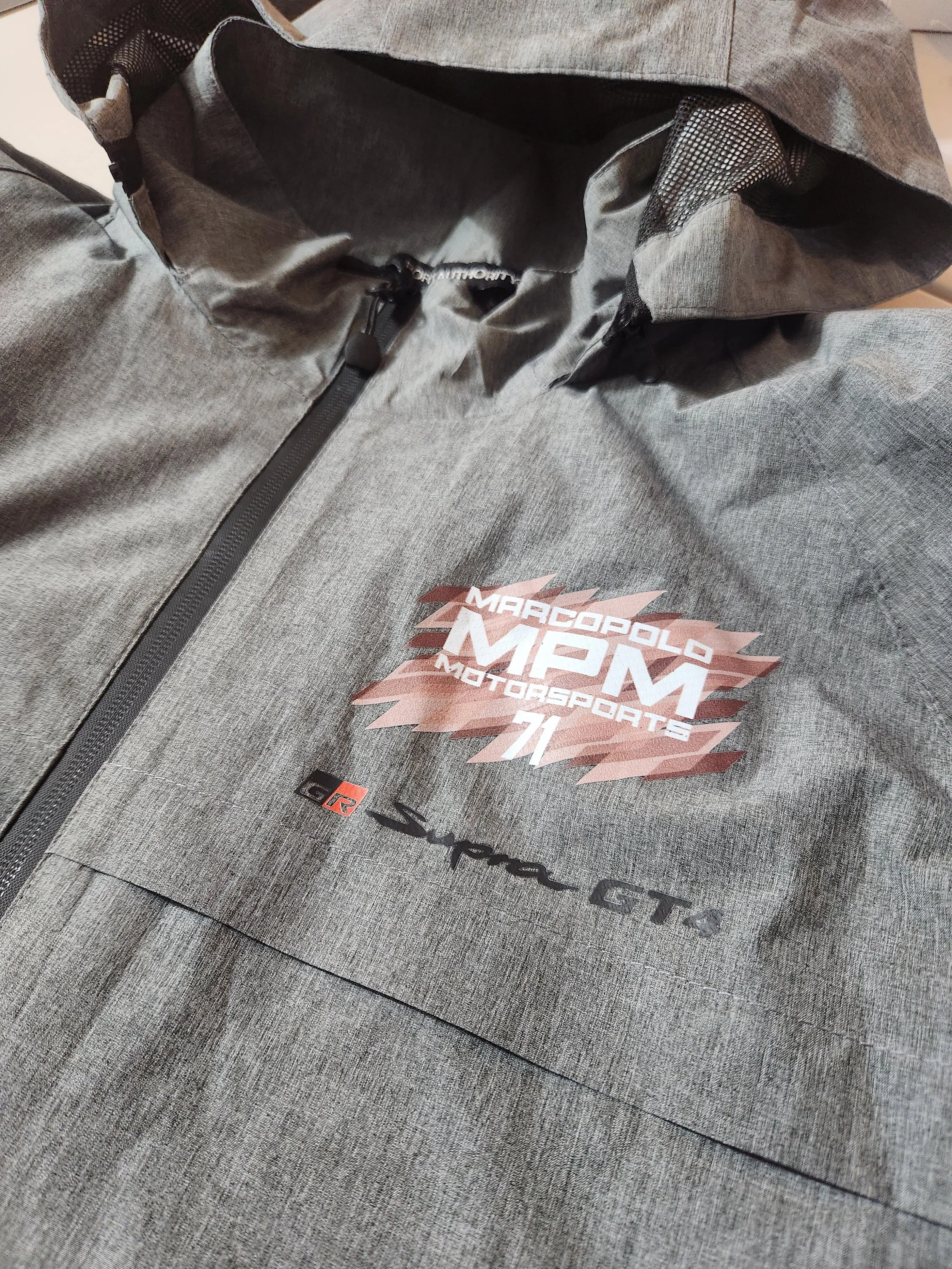
The new design pays homage to the original design from when the MPM team was first started but brings it to life with a dynamic expression. The essence of the design is symbolic reference to a race score board. Each tally on the design represents a race, another time on the score board. As the driver practice and progresses, the score board is filled, each lap more intense than the last. After enough laps, each tally builds up to a bigger picture; a more skilled and experienced driver.
Similar style, different message.
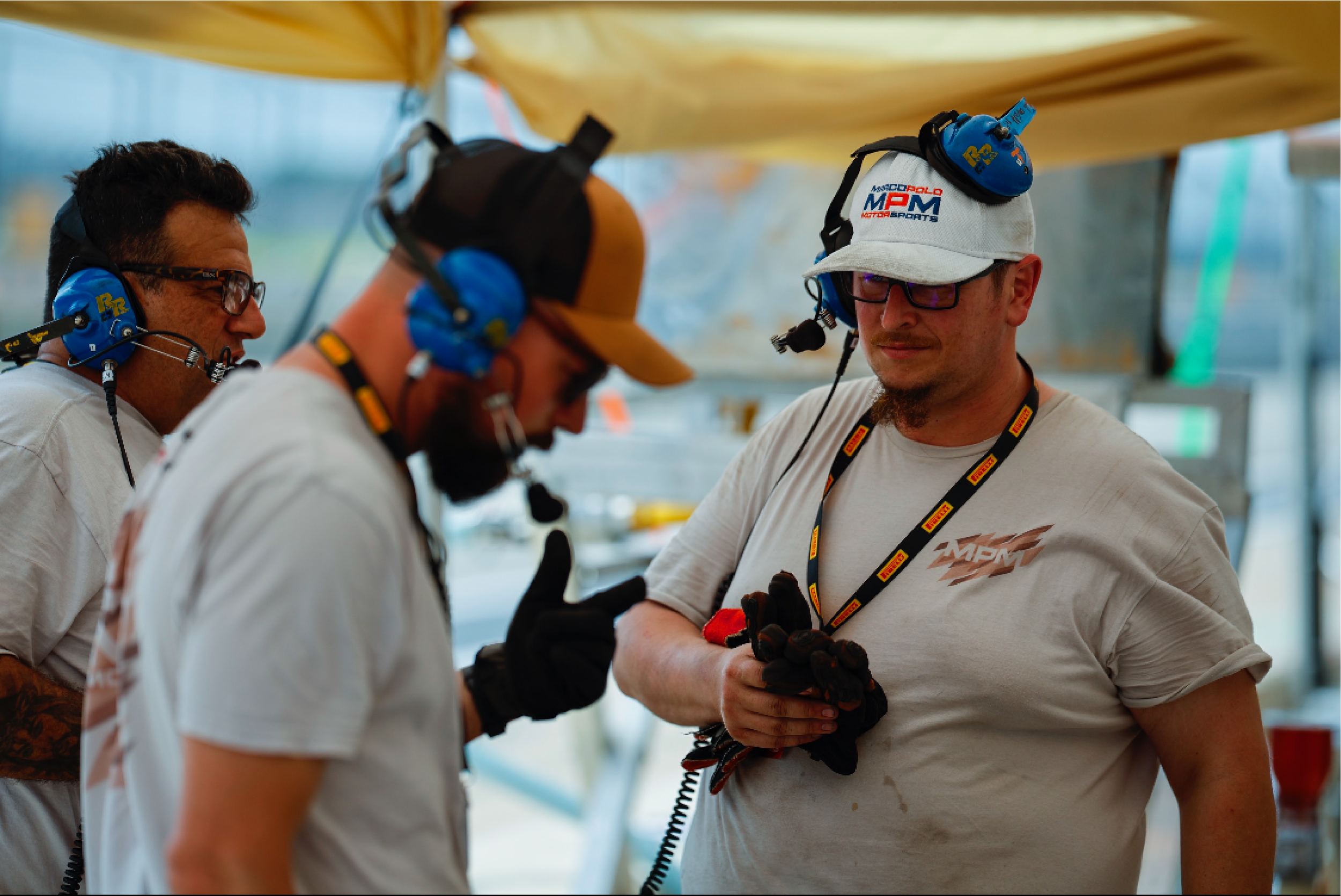
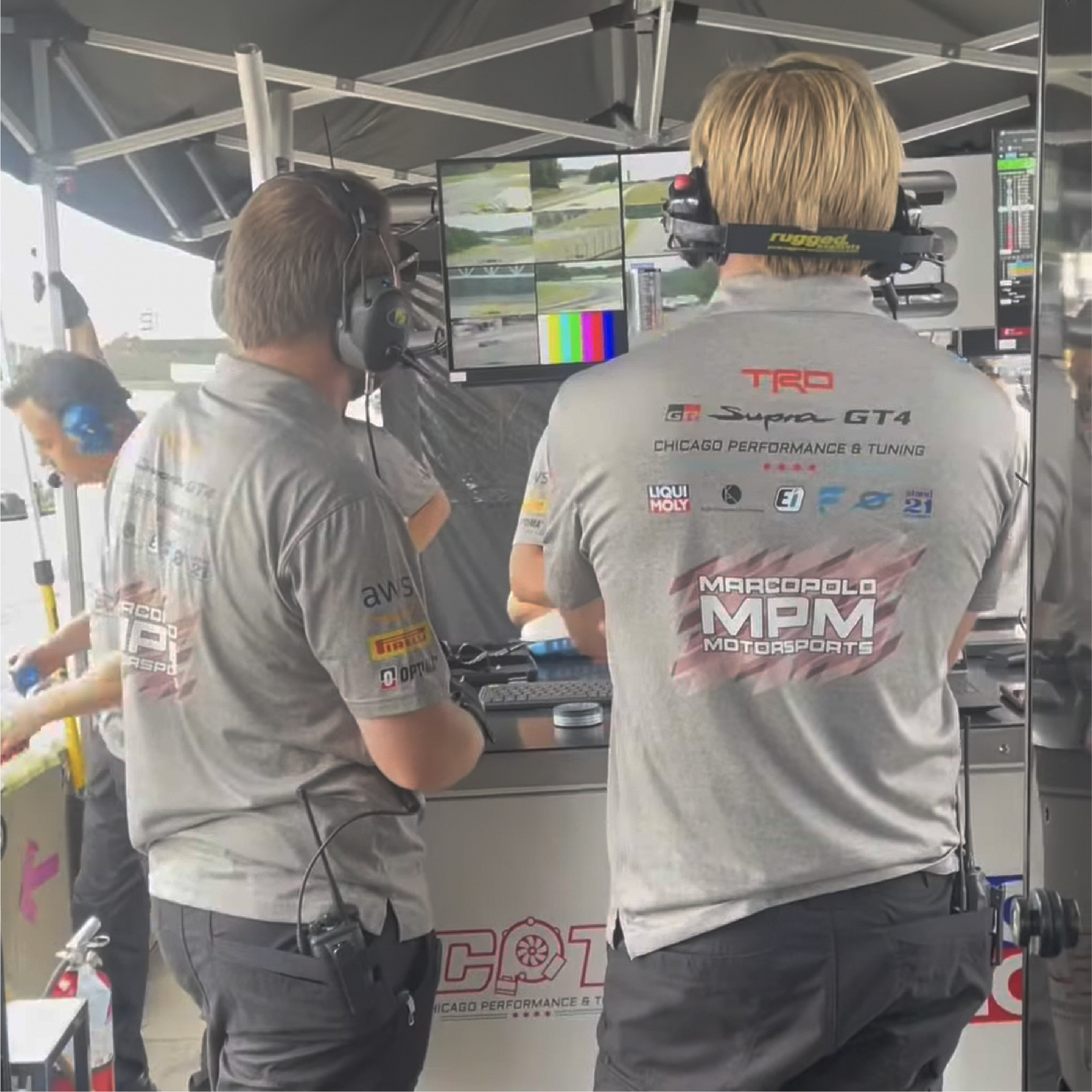
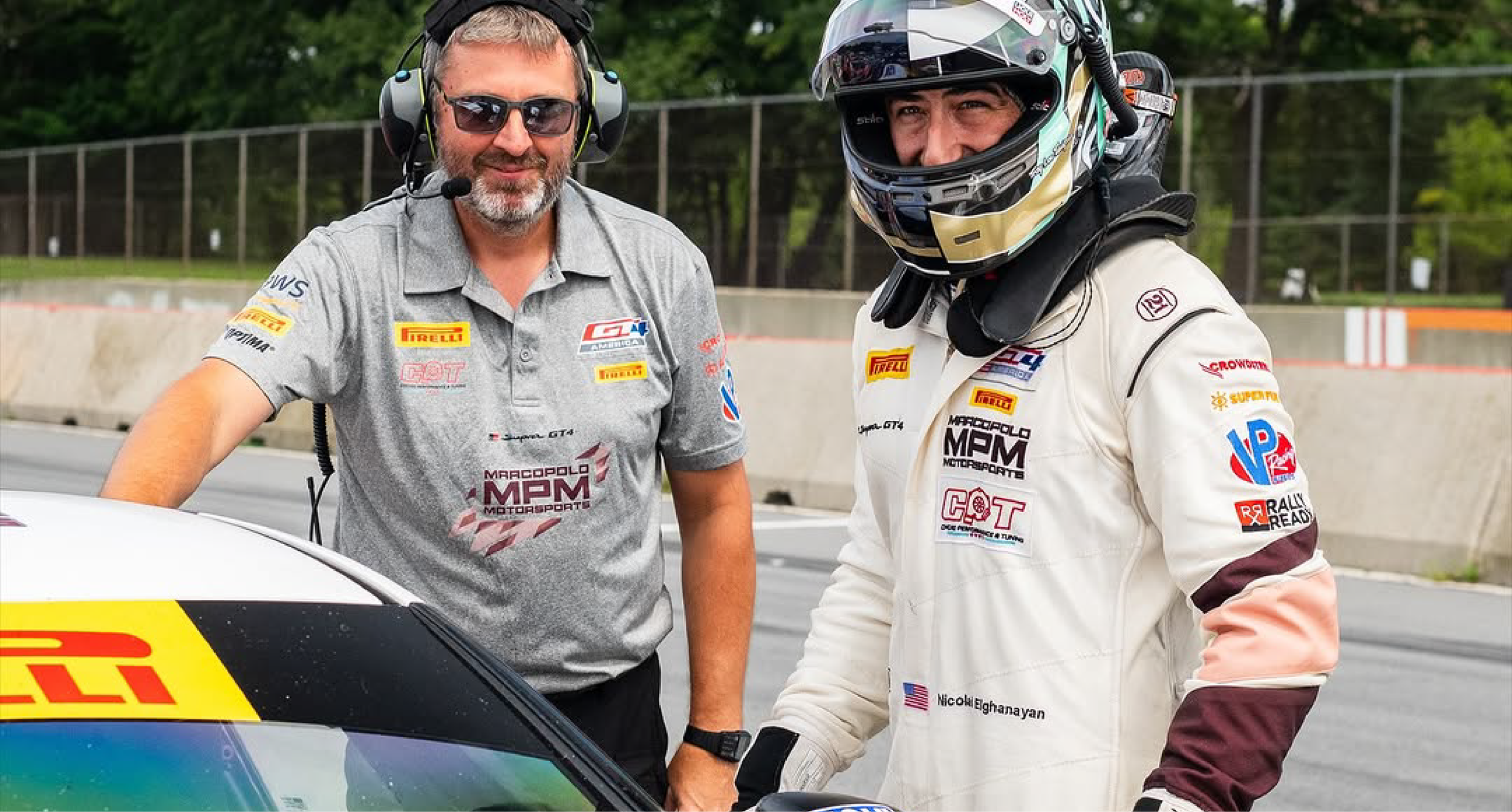
With the start of a new season, Marco Polo Motorsports walks out with a new identity and fresh start to compete in the GT4 series.